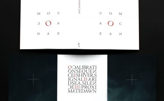
...the artwork's text resembles (at a squint) something like a boustrophedon, but there's a strong sense that the label Keraunograph have spent a lot of time thinking about font-weights, spacing and those typographical niceties. What I'm saying is that where the sleeve actively resists identification by typical modes, there's emphasis placed elsewhere that makes it identifiable, if not 'legible'.
Daily archives: 20/05/2024
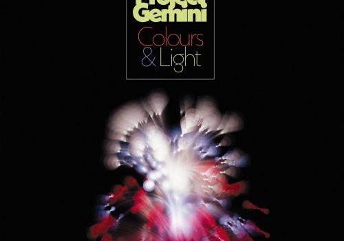
This is the second outing for Paul Osborne's Project Gemini and for the opening snippet I wrote "woodland samba Dr Who theme with flute". This gives you some indication of the number of touchstones that are present on Colours & Light and it is a good title as well, because the album is all about the vibrancy of the outdoor world in all its glories, taking in funk elements, baggy twists and soundtrack drama in its inimitable stride.
...the sixth tone harmonium is a harmonium with three registers that's tuned very differently to your average twelve-tone equal temperament piano. The sound here is "very microtoney". The daddy of this is Alois Hába (1893-1973), a Czech composer who saw greater harmonic possibilities from expanding the reach of Western tonality, rather than the increased compositional complexity of twelve tone (as created by Arnold Schönberg).


